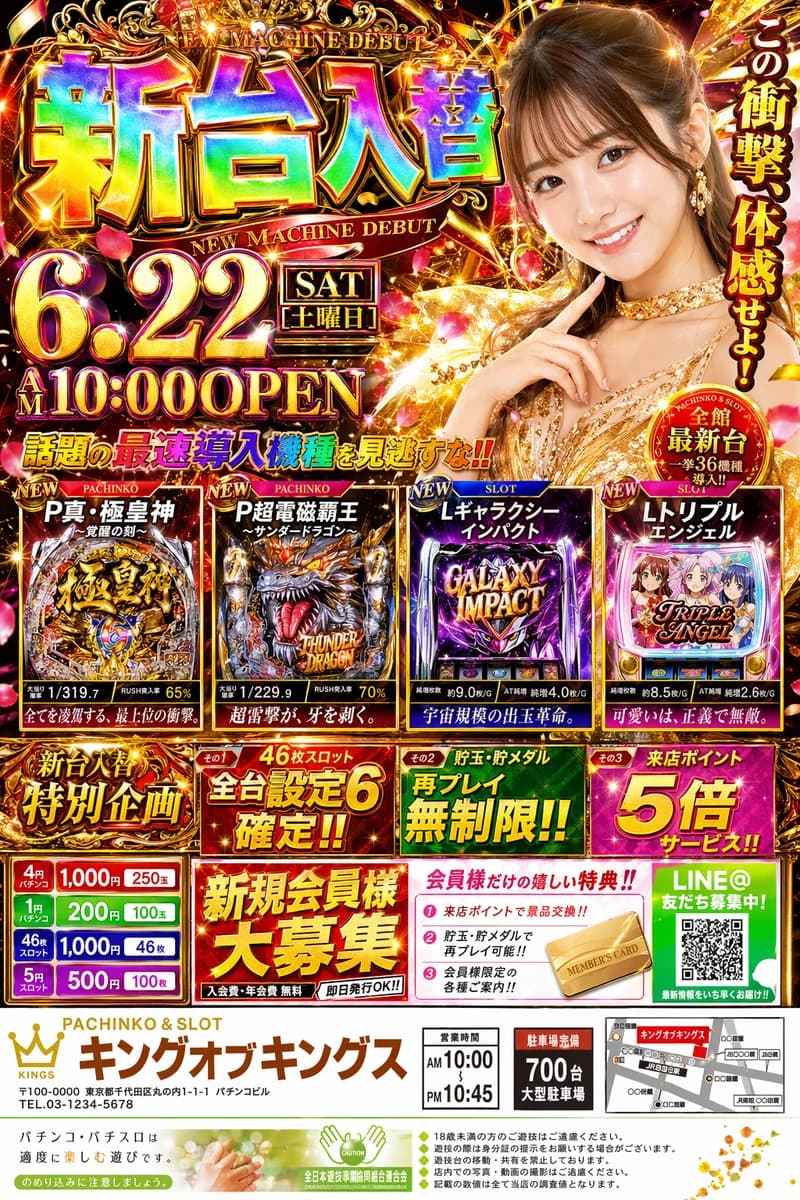
Flyer arcoíris de pachinko japonés
Más Pósters y anuncios
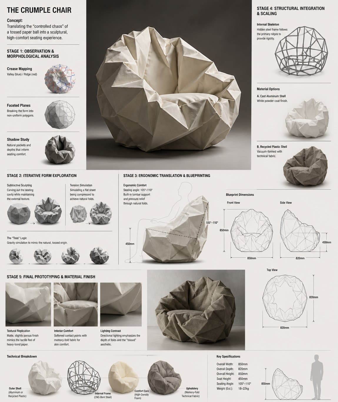
Tablero de R&D del sofá conceptual Crumple Chair
Design Concept: The Crumple Chair Core Philosophy: Translating the "controlled chaos" of a tossed paper ball into a sculptural, high-comfort seating experience. Stage 1: Observation & Morphological Analysis The goal is to deconstruct the image of the crumpled paper into usable geometric data. Crease Mapping: Identify the primary "valley" and "ridge" lines. These represent potential structural ribs or seams in the chair. Faceted Planes: Break down the sphere into a series of non-uniform polygons. Each flat surface of the paper becomes a potential panel for the chair’s upholstery or shell. Shadow Study: Analyze how the "tossed" form creates deep recesses. These natural pockets guide where the user’s weight will be cradled. Stage 2: Iterative Form Exploration Moving from a sphere to a seat through "Digital Crumpling." Subtractive Sculpting: Imagine the paper ball as a solid mass. Use Boolean operations to "carve out" a seating cavity that fits the human form while maintaining the external jagged texture. Tension Simulation: Use 3D software (like Rhino or Blender) to simulate a flat sheet of material being compressed. This ensures the folds look authentic and not "modeled." The "Toss" Logic: Experiment with gravity-based simulation dropping a digital mesh to see how it settles naturally, mimicking the "tossed" origin. Stage 3: Ergonomic Translation & Blueprinting Refining the raw aesthetic into a functional object. The Comfort Core: Overlay a standard ergonomic template (Seating Angle: 105°–110°) over the crumpled form. Adjust the internal "folds" to provide lumbar support and pressure relief. Blueprint Generation: Create technical orthographic views (Front, Side, Top). Map out the dimensions: Seat Height: 450mm Total Width: 850mm Surface Smoothing: Maintain the sharp "paper edges" on the exterior shell while softening the interior contact points for skin comfort. Stage 4: Structural Integration & Scaling Making the concept physically viable. The Skeleton: Design a hidden internal frame (likely CNC-bent steel rods or a 3D-printed lattice) that follows the most prominent ridges of the paper folds to provide rigidity. Material Selection: * Option A (High-End): Faceted, cast aluminum with a white powder coat. Option B (Soft): Vacuum-formed recycled plastic shell covered in "memory-fold" technical fabric that retains a wrinkled appearance. Stage 5: Final Prototyping & Material Finish Textural Replication: Apply a matte, slightly porous finish to the material to mimic the tactile feel of heavy-bond paper. Lighting Contrast: Use directional studio lighting in the final renders to emphasize the "tossed" shadows, making the chair look like a giant piece of discarded inspiration. Design Tip: To keep the "tossed" look authentic, avoid symmetry. The most compelling aspect of a crumpled paper ball is its unique irregularity—ensure the left and right sides of the chair are balance-equivalent but not identical
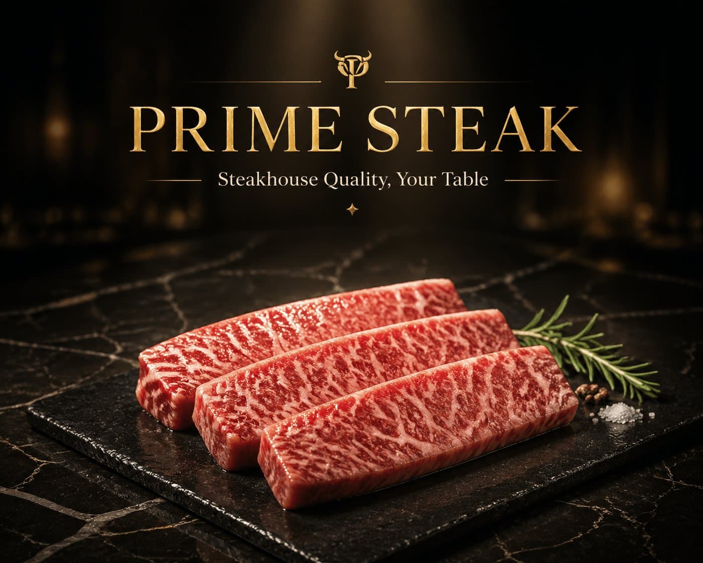
Hero image premium de marca de carnes y mariscos
一、品牌基础设定 品牌名称:[请填写,例如:PRIME STEAK / OCEAN PRIME] 品牌标语:[请填写,例如:Steakhouse Quality, Your Table / Restaurant Grade, Home Delivered] 主色调:[请填写,例如:黑金 / 深红+金 / 深蓝+银] 字体风格: 标题:[请填写,例如:金色衬线体,大写,奢华感] 正文:[请填写,例如:细衬线体/无衬线体] 二、核心视觉元素 台面材质:[请填写,例如:大理石/黑色石板] 背景调性:[请填写,例如:深色渐变/暗调餐厅环境] 光线风格:[请填写,例如:聚光/侧光/顶部照明] 三、主产品定义(必填) 产品名称/类型:[请填写,例如:和牛牛排 / 帝王蟹 / 北极甜虾] 产品数量/摆放:[请填写,例如:1份单品 / 3块整齐摆放] 呈现方式:[请填写,例如:切片展示 / 带骨展示 / 原壳展示] 产品特色/质感提示:[请填写,例如:肉质纹理清晰、多汁感 / 光泽晶亮 / 肉眼可见油花]
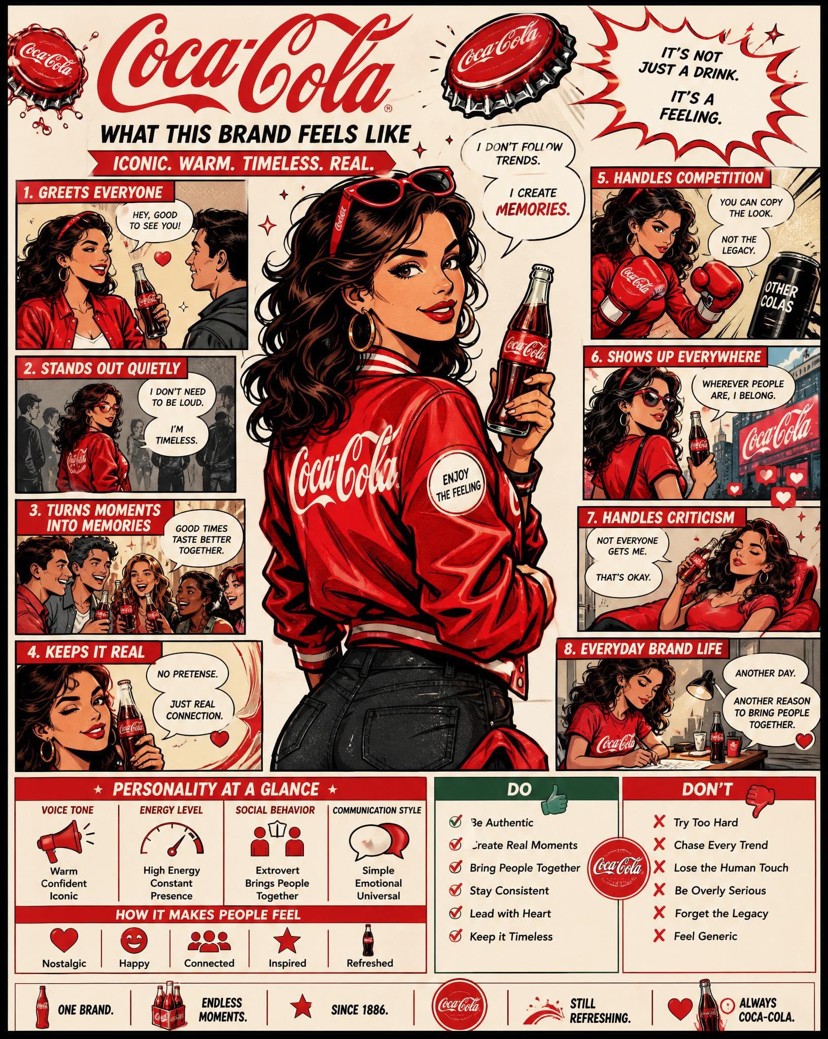
Infografía cómica de personalidad de marca
Using the uploaded logo, create a highly detailed, comic-style infographic poster: “What This Brand Feels Like” GOAL: Turn the brand into a living personality and visually explain how it behaves, speaks, and interacts with the world. This must feel like a mix of: brand strategy + character design + comic storytelling. --- CORE RULE: Everything must come from the logo: - colors - style - tone - personality No generic personality traits. --- MAIN STRUCTURE: Vertical 4:5 poster Dense layout with multiple panels Comic + infographic hybrid --- TOP SECTION: - Brand name - Short personality statement (max 6 words) Example: “Quiet confidence with sharp edges” --- MAIN CHARACTER (VERY IMPORTANT): Create a central character representing the brand: - humanized version of the brand - outfit reflects brand style - posture + expression reflect personality --- AROUND THE CHARACTER: Create 6–8 comic panels showing how the brand behaves in different situations. --- SCENARIO IDEAS: - Talking to customers - Handling competition - Selling a product - Social media presence - Reacting to criticism - Daily “brand life” moment --- FOR EACH PANEL: Include: - short caption (max 6 words) - speech bubble or internal thought - clear visual action --- TONE EXAMPLES: Luxury brand: calm, confident, minimal speech Playful brand: loud, chaotic, expressive Tech brand: precise, logical, clean --- PERSONALITY TRAITS SECTION: Add small labeled blocks: - Voice tone (e.g. calm, bold, playful) - Energy level (low / medium / high) - Social behavior (introvert / extrovert) - Communication style Use: - icons - short labels --- DO / DON’T SECTION: Add a split block: DO: - how the brand should act DON’T: - what breaks the identity Keep: - very short phrases --- VISUAL ELEMENTS: - speech bubbles - icons - arrows - small reactions - exaggerated comic expressions --- STYLE: - comic + editorial hybrid - slightly exaggerated but still premium - expressive but not childish --- COLOR: - strictly based on logo palette - use color to reinforce personality --- DEPTH: - 20–40 visual elements - multiple small panels - layered composition --- IMPORTANT RULES: - must feel alive - must feel specific - no generic marketing words - no empty areas - keep text short but impactful --- FINAL FEEL: Like: - a brand strategy turned into a character - a visual storytelling board - something people save and study NOT: - flat - generic - minimal
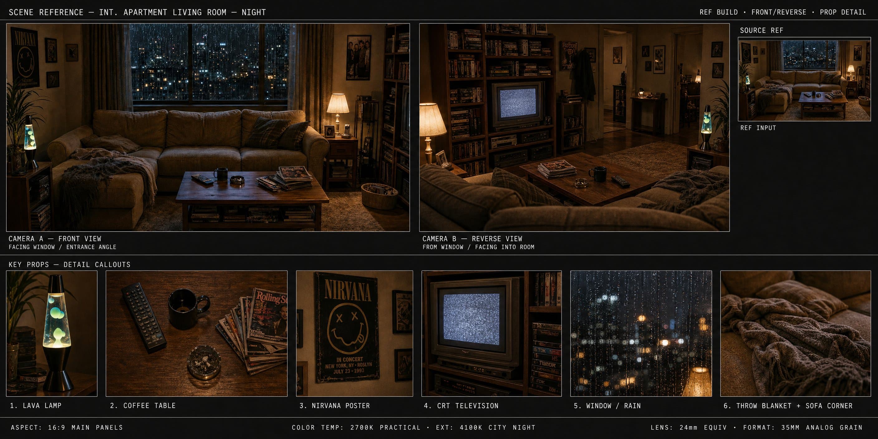
Tablero de referencia de apartamento años 90
{ "type": "scene reference board — 90s apartment living room, cinematic night", "style": "cinematic film photography, 35mm grain, warm amber shadow fill, deep chiaroscuro lighting, hyper-detailed interior, production design reference quality", "layout": { "main_panel_center_left": { "label": "CAMERA A — FRONT VIEW", "scene": "Wide shot, L-shaped tan sectional sofa, grey knit throw blanket, wooden coffee table (remote, mug, ashtray, Rolling Stone stack), lava lamp left, table lamp right, rain-streaked city window behind, Nirvana poster left wall. 35mm grain." }, "main_panel_center_right": { "label": "CAMERA B — REVERSE VIEW", "scene": "Wide reverse from behind sofa. CRT TV prominent right, grey static screen. Tall bookshelf, VHS tapes. Cool blue backlight from window behind camera. Deep shadow." }, "prop_strip_bottom": "6 close-up tiles: 1. LAVA LAMP — chrome base, blue-green wax blobs; 2. COFFEE TABLE — remote, mug, ashtray, magazines; 3. NIRVANA POSTER — black smiley face, wall texture; 4. CRT TELEVISION — static screen, VHS stack; 5. WINDOW/RAIN — city bokeh, water streaks; 6. THROW BLANKET — sofa corner, worn upholstery", "top_right_inset": "SOURCE REF thumbnail — original photo", "footer": "2700K PRACTICAL · 4100K CITY NIGHT · 24mm · 35MM" }, "background": "deep charcoal #1a1a1a, thin white separators", "dimensions": "wide landscape 3:1, high resolution" }
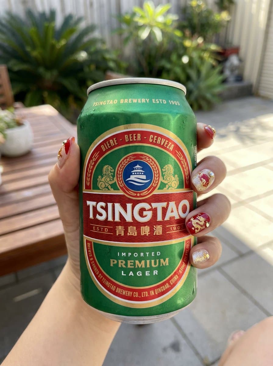
Colección de ropa femenina inspirada en Tsingtao
Inspired by Tsingtao (China beer)🍺 “Inspired by this product, design a set of cool-style women's clothing”
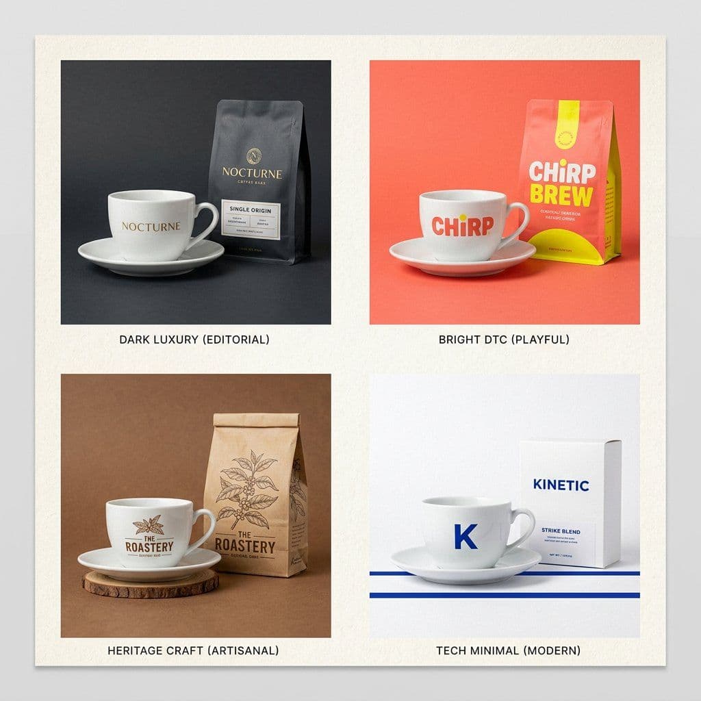
Anuncio de producto envoltura de marca
The Brand Envelope | GPT Image-2 Prompt #89 This takes any product photo and wraps it in your specific brand world. Different product each time. Same brand, every time. PHASE 1 / ANCHOR: Describe [BRAND IDENTITY] in 2 lines. Palette, texture, mood. PHASE 2 / INJECT: Place [PRODUCT] inside that brand world, not the reverse. PHASE 3 / FORMAT: Set [OUTPUT FORMAT]. Hero, square ad, or story. PHASE 4 / SIGNATURE: Apply [BRAND ELEMENT]. Grain, shadow, or overlay. Swap: [BRAND IDENTITY] / [PRODUCT] / [FORMAT]