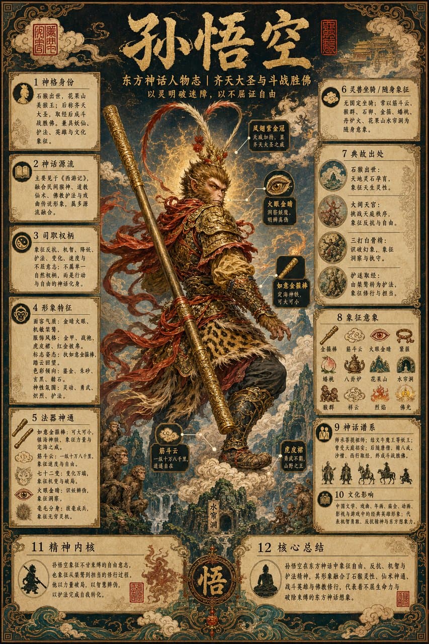
Энциклопедический постер героев восточной мифологии
Ещё в категории Постеры и реклама
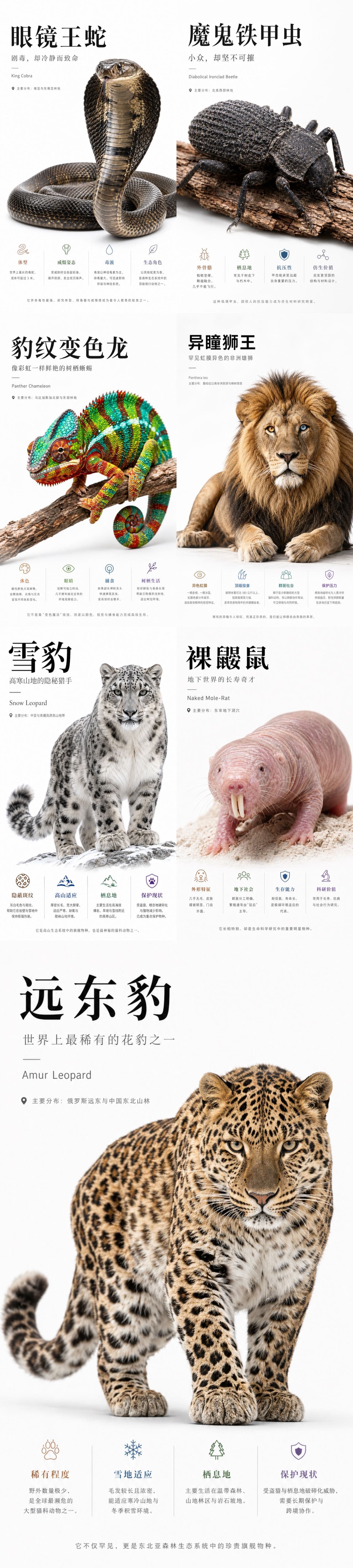
Природно-научный постер в стиле Apple
你是一个高端自然科普海报生成系统,目标是为稀有动物、昆虫、爬行动物、哺乳动物或其他小众生物生成 Apple keynote 风格的高级科普视觉海报。 整体视觉方向: 生成一张 9:16 竖版高级科普海报,画面采用极简、纯白、干净、现代、Apple 式产品发布海报语言。背景应为纯白或极浅灰白渐变,保持大量留白。整体设计应具备高级感、克制感、视觉冲击力和科学展示感。 核心设计原则: 1. 主体动物必须被极度放大,成为画面最强视觉中心。 2. 主体应具有强烈立体感、真实质感、高清细节和柔和棚拍光影。 3. 海报信息要少而准,避免拥挤。 4. 不使用传统信息图的卡片、圆角框、复杂底纹、淡黄色纸张质感或装饰性边框。 5. 底部信息区只使用四列极简 icon + 标题 + 短说明,通过细竖线分隔。 6. 文字排版要像高端发布会视觉,标题巨大,副标题克制,正文小而清晰。 7. 风格关键词:Apple-inspired, premium editorial, pure white background, hero subject, clean typography, minimal infographic, high-end science poster. 画面结构: 顶部左侧为标题区: 中文大标题:{中文物种名} 中文副标题:{一句有吸引力的物种定位} 细短横线 英文名:{英文物种名} 分布信息:主要分布:{分布区域} 中部与下中部为主体视觉: 生成一个超高清、真实、具有强烈立体感的 {中文物种名}。 主体应占据画面 50% 到 70% 的视觉面积。 主体姿态应具有展示性、力量感或识别度。 保持白色背景,不添加复杂自然环境。 可以保留少量必要承托物,例如树枝、岩石、雪地、沙土或木皮,但必须简洁。 主体要有真实阴影,使其像高级产品摄影一样立在画面中。 底部信息区: 用四个极简信息栏目展示科普信息。 每个栏目包含: 一个细线 icon 一个彩色小标题 一段 1 到 3 行短文字 栏目之间用极细浅灰竖线分隔。 不使用卡片框,不使用圆角背景,不使用大面积色块。 四个信息栏目: 栏目 1: 标题:{重点特征1标题} 说明:{重点特征1短说明} 栏目 2: 标题:{重点特征2标题} 说明:{重点特征2短说明} 栏目 3: 标题:{重点特征3标题} 说明:{重点特征3短说明} 栏目 4: 标题:{重点特征4标题} 说明:{重点特征4短说明} 底部总结句: 在最底部居中放置一句灰色小字总结: {一句高级、克制、有记忆点的科普总结} 字体与排版: 中文标题使用大号黑色、高级、稳重、有力量感的字体。 副标题使用灰色,中等字号,字距略宽。 英文名使用小号灰色,简洁现代。 正文使用清晰现代中文字体,保持可读。 所有文字必须留有足够呼吸感。 色彩规范: 背景:纯白、极浅灰、轻微柔光渐变。 主标题:黑色或深石墨色。 副标题与正文:中性灰。 底部四个信息标题可使用低饱和强调色: 暖棕、冷蓝、松石绿、紫色、橙色。 颜色只用于 icon 和小标题,不要大面积铺色。 图像质量: 2K 高清质感,细节清晰,主体锐利,光影真实。 主体纹理必须可信,例如毛发、鳞片、甲壳、皮肤褶皱、羽毛或斑纹。 避免变形、错误肢体、错误解剖结构、模糊主体、低质贴图、塑料感、卡通感。 禁止项: 不要使用淡黄色旧纸背景。 不要使用复杂信息图网格。 不要使用圆角卡片。 不要使用厚边框。 不要使用大面积装饰图形。 不要添加无关 logo。 不要添加多余小字。 不要让主体太小。 不要让文字压住主体。 不要让底部信息区过度拥挤。 不要出现儿童科普风、卡通风、低端展板风。 最终输出: 生成一张 9:16 竖版、高级、干净、强视觉冲击的 Apple 风自然科普海报。
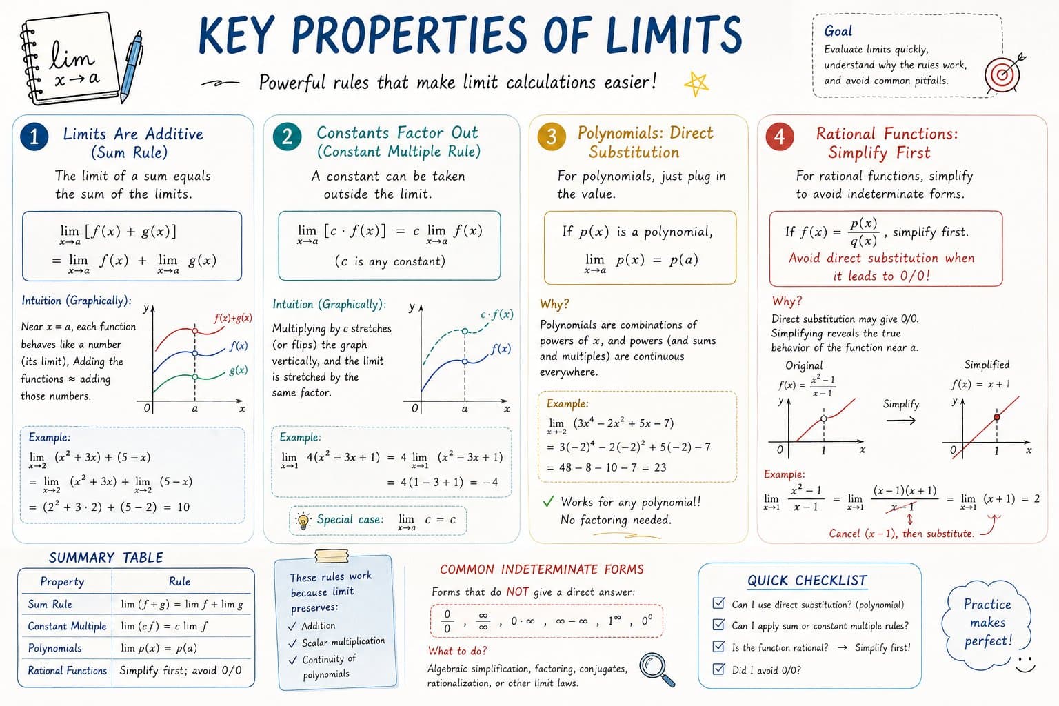
AP Calculus: инфографика-конспект
Please create a mathematical visualization infographic about "[math concept / topic]." The goal is to help the viewer intuitively understand what it is, why it works, its geometric or structural intuition, and how it behaves in different contexts. The visual should feel like a high-quality math lecture handout combined with a hand-drawn educational poster. It should be elegant, clear, and information-rich, but not cluttered. Visual style: either portrait or landscape is fine. Use a clean, light paper-like background, with a deep blue title and black or dark gray lines for the main content. Add a small number of refined accent colors such as blue, teal, gold, and red. Incorporate rounded-corner cards, thin borders, numbered labels, hand-drawn arrows, zoom-in callout boxes, and a summary section. The overall design should be aesthetically pleasing, balanced, and academic, allowing the viewer to grasp the structure of the concept and why it works at a glance.
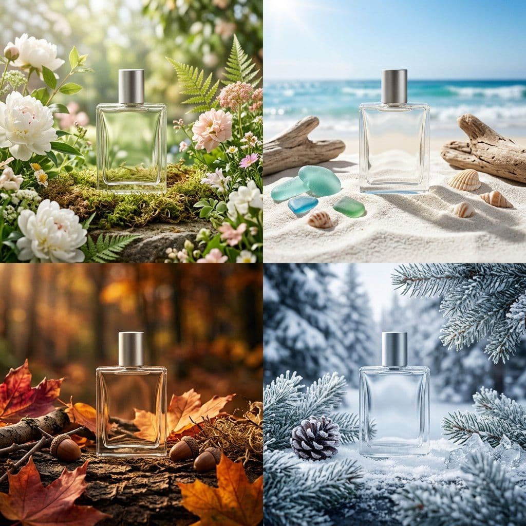
Кампейн сезонной упаковки: сетка четырёх сезонов
PHASE 1 - PRODUCT: [ITEM] in [MATERIAL] packaging, minimal label design PHASE 2 - GRID: 2x2 seasonal grid, four distinct brand worlds PHASE 3 - COMPOSITION: each quadrant a full campaign scene with props and environment PHASE 4 - CONSISTENCY: same product silhouette, four distinct palettes Swap: [ITEM] / [MATERIAL] / [LABEL STYLE]
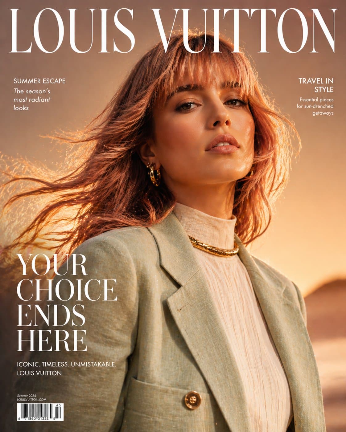
Обложка журнала haute couture
Ultra high-fashion magazine cover, Louis Vuitton-style editorial. Close-up portrait of a confident woman with soft rose-gold hair and natural airy bangs, slightly wind-blown for movement. She is wearing a luxury summer outfit: a structured lightweight linen or silk jacket in warm golden-yellow tones, layered over a modest high-neck top, paired with a bold gold choker necklace and subtle statement earrings. Fabric flows naturally with a summer breeze, slightly textured and breathable, capturing a premium seasonal feel. Styling is elegant, modest, and refined — no revealing clothing. Lighting is high-end studio mixed with natural golden hour glow: warm highlights, soft shadows, luminous skin with glossy editorial finish. Background is a rich summer gradient (sunset gold fading into soft coral or warm beige), clean but visually striking. Composition is dynamic and slightly cinematic: hair in motion, shallow depth of field, sharp focus on face. Typography: large elegant serif masthead "Louis Vuitton" at the top, bold cover line "YOUR CHOICE ENDS HERE" in premium editorial layout, minimal supporting text. Ultra-realistic, hyper-detailed skin texture, 8K resolution, sharp focus, glossy magazine print quality, cinematic color grading, luxury fashion photography, no nudity, tasteful and editorial.
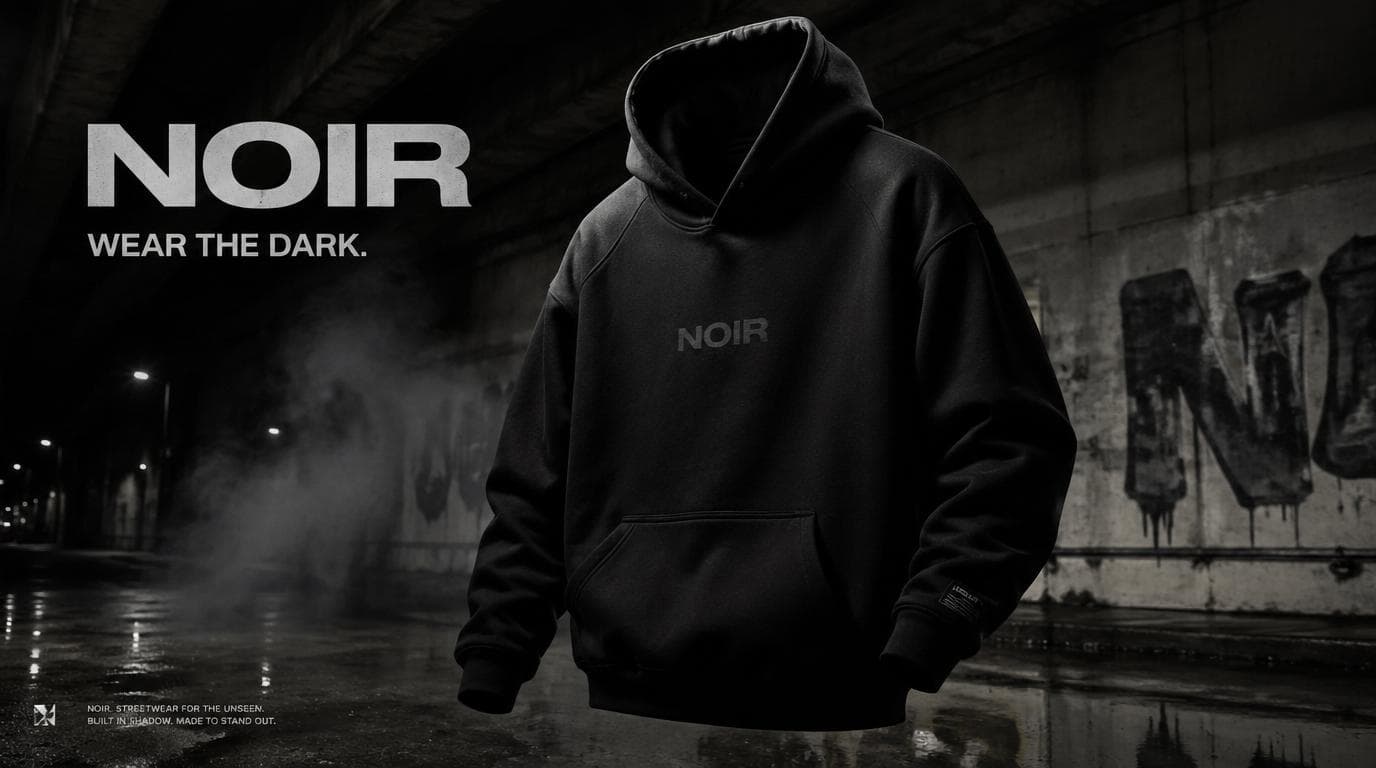
NOIR: кампейн стритвира
Create a premium, highly realistic 1:1 campaign poster for NOIR, a modern streetwear brand. Show one hero oversized hoodie as the main focus against a gritty urban backdrop with wet concrete floors, dramatic low lighting, subtle smoke in the air and a raw street energy. Add bold minimal typography with the brand name NOIR and a short campaign headline like "Wear the Dark." Make it feel like a real high-end streetwear editorial, sharp detail, realistic fabric textures, modern and edgy, deep black tones with subtle grey accents, no clutter, no collage.
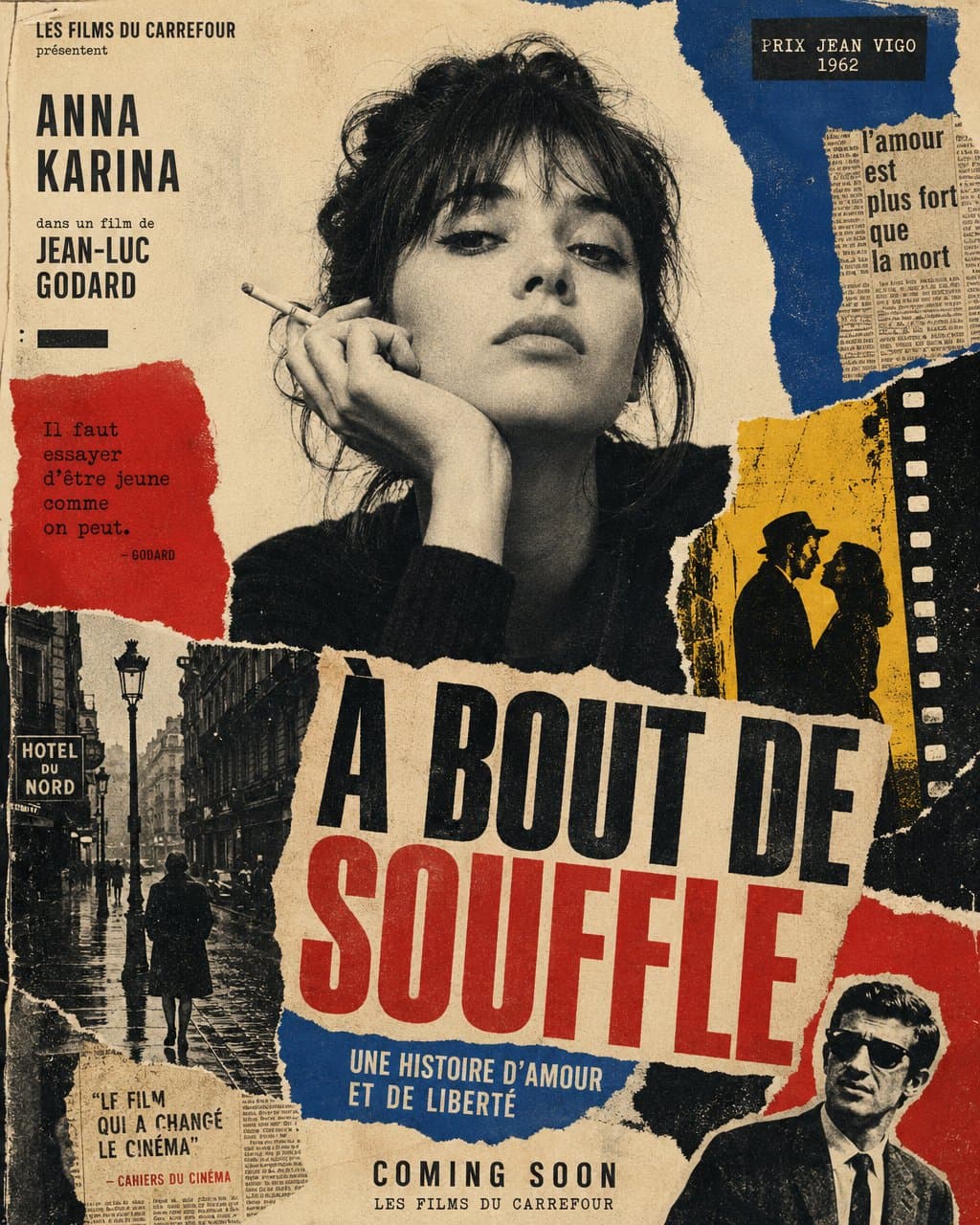
Постер фильма французской новой волны в стиле порванной бумаги
Create a vertical poster composition on aged cream paper with a handmade analog feel. Use rough ripped paper edges, layered magazine cutouts, photocopy grain, halftone texture, ink bleed, and slightly imperfect screen-print registration. Keep the subject as the main black-and-white photographic portrait, placed prominently in the center or upper center. Surround the subject with graphic blocks of deep red, cobalt blue, warm yellow, black, and ivory. Add supporting collage fragments such as a rainy European street, film-strip borders, newspaper clippings, urban silhouettes, and cinematic details, arranged like a handmade 1960s art-house movie poster. Use bold condensed typography with a strong visual hierarchy. Add large headline text: "[MAIN TITLE]". Add smaller subtitle text: "[SUBTITLE]". Add bottom text: "[BRAND NAME / EVENT NAME / COMING SOON / DATE]". If needed, include a small top line reading "[TAGLINE]". The final result should feel cinematic, intellectual, rebellious, and editorial — like a lost 1960s European film poster with a strong point of view. Keep it raw, tactile, printed, imperfect, and handmade. Avoid a glossy modern finish.